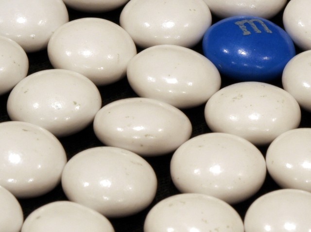
good idea but execution is lacking. light doesnt enhance the picture, good use of colors but the dirty whites distract. composition is too much top right imo. like the square crop. with a bit more work could really shine.
My favorite of the candy shots (don't you hate it when a bunch of other people have similar ideas?). The blatant differentness of the blue M&M works nicely to convey the challenge topic, and I like its placement in the frame.
Nice arrangement of m&m, just that the DOF is too shallow. And the white m&m looks dirty. Perhaps you should color those with white paint before shooting.





 Add photograph to your favorites
 Add photographer to your favorites


 Photographer found comment helpful.


