|
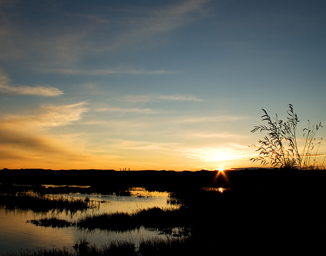
The blue doesn't seem strong enough to match the intensity of the orange. Also the orange and blue fade into one another so you lose that high contrast element you get from strong adjacent complementary colours. Well composed thogh and the silhouette is well defined |






 Add photograph to your favorites
 Add photographer to your favorites


 Photographer found comment helpful.

