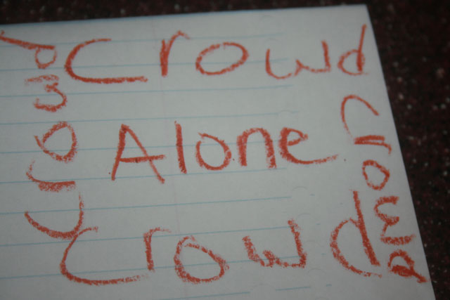
This picture took alot of time and energy. i hope that i do good in this first challenge of mine. please comment if there is anything wrong, which i highly doubt. thank you.
the way i did this was:
i took an ORANGE crayon, and wrote on a WHITE piece of paper.
Statistics
Place: 93 out of 93 Avg (all users): 3.5502 Avg (commenters): 3.5833 Avg (participants): 3.4615 Avg (non-participants): 3.5652 Views since voting: 1393 Views during voting: 452 Votes: 269 Comments: 41 Favorites: 0
People are being way too harsh on this photo. Your technicals could be better, focus and lighting specifically. But way to think out of the box. Hope you enter more.
OK, you took the challenge literally. Cute, but that probably won't win many people over, and it's not a very sharp picture. This may be competing for brown.
photo is a little dark, you can try using levels and move the middle and right lider to the left to brighten. I think this would have been more successful if you had made the words out of something like rocks, peas anything. just my two cents
a clever, humerous take on the challenge but I believe that it has an appearance of being thrown together in a hurry. I feel that the the focus is a bit off and that this might have been better compositionally if written in the center of the page so the edge of the paper would not be in the frame.
Heh. The 'd' in the upper right is out of focus, as is the 'cr' in the right crowd. Next time, I would go for a better depth of sharpness, and some stronger lighting would also be helpful. Finally, the table on the top and the right is destracting, and should either be cropped out or excluded from the composition.
Looks like a feeble attempt to enter anything... Maybe if you had made the lettering more professional looking, printed out a bunch of the words crowd from your computer it would improve it.
The words around the edge should be one large "crowd" since it is "a" single crowd rather than "crowds" plural.
Other than that pedantry the picture suffers from a lack of depth of field and the positioning of the paper in relation to the background looks slapdash.
We have a winner! Awesome crayon technique as well as a superb literal (or "literary") interpretation of the topic. If this doesn't ribbon, I will write such a rant! :P





 Add photograph to your favorites
 Add photographer to your favorites


 Photographer found comment helpful.


