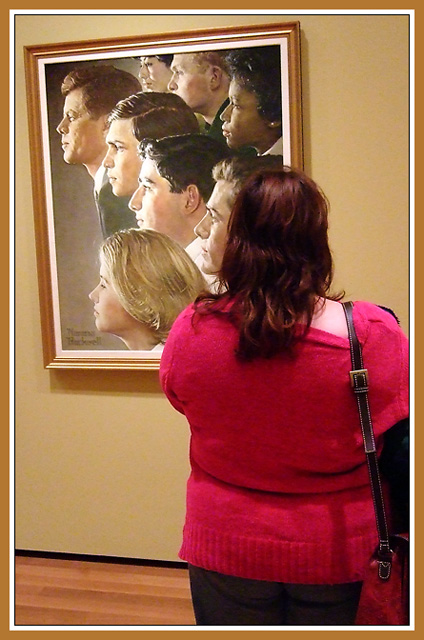
This photo is fun and fascinating on its own, and is even more intriguing in the context of the challenge. The way she becomes part of the painting, or rather, the painting becomes part of her, makes her alone in its crowd. The way her hair becomes his, making him alone... there's a poignant sort of sharing of aloneness here, something hopeful about it. And then you framed the picture the same way the painting is framed.
But most of all, it's unique, original, unlike anything I've seen before. So I'm giving you my own personal ribbon, the Posthumous Blue.
I thought at first that the frame was too distracting, then I noticed that it's nearly identical to the frame in the shot (sort of photo in photo). Also, the person standing looks like she's looking to the left (wierd looking, but interesting) Was this intentional, I wonder?
I hope this does well, I wish the frame was straight, but thats all I would change. I think I wish it was straight so you wouldn't get marked down by other voters though, not because I think it makes a great difference in what I think of the photo. :)
Great idea. You also did a fine job mimicking the lighting in the painting. A tighter crop to eliminate the distracting floor and purse would have gone far.
There is a lot to like about this. At first glance I thought the spectator had her head turned in the same direction as the portraits, but then realized that was an optical illusion of sorts. Kudos on getting just the right angle to do that. The painting looks cockeyed and the horizon isn't level, but somehow that isn't bothering me, and the frame echoing the portrait frame is a nice touch. My first inclination was to say her posterior should be cropped out, but on reflection everything about her - fuschia sweater, too-tight pants, oddly magenta tint in her hair - is sort of the antithesis of the noble, gently lit, subtle tones of a Rockwell. She doesn't belong with those she contemplates. I wonder what she was thinking?
curious...i like how the angle of the painting is askew. adds to the laugh how you chose to frame it like the original. this reminds me of a photo i saw of a woman and her dog she held close to her face under a hat. it looked like she had a poodle head. your photo feels a bit cramped... perhaps that was intended
Wonderful how her face is exactly the right size and the lighting is in the right direction to blend the woman in with the painting. Nice setup. Oh, and I like the border framing the image like the frame on the painting. The only thing I'd like to see changed is the way the purse strap is dragging the sweater off the woman's shoulder. It is a little distracting. As a matter of face, I think I could do without the purse all together. 9
The angle is weird - interesting though. I don't know if it was intentional (probly was), but I thought that face in the painting was her profile at first. I really like the way you matche the border to the picture frame. Well done!





 Add photograph to your favorites
 Add photographer to your favorites


 Photographer found comment helpful.


