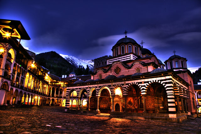
I think the halos kill this. And it seems a bit too dark in the foreground and what looks like some colour breakup. Composition isn't bad, but if it was straightened it would probably hold more appeal. 5.
I think this shot has a bit too much editing, I find the halos above the building a bit too much and distracting. Also try and get your images up to 150 kb, yours is 94 kb, it will help with those finer details like the things inside those arches. Here is a little tutorial that might help you get the most out of your entry. The place looks really beautiful. :)
Joe







 Add photograph to your favorites
 Add photographer to your favorites


