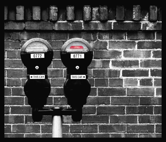
Ok so when was the last time you felt a parking meter was a work of art? the elements in this shot bring this together quite well for me...I worry maybe to well:) the voters will speak!
I isolated the "expired" sign and took the rest of the image to black and white...I like the lone element as a way to pull the viewer into the shot.
Statistics
Place: 19 out of 169 Avg (all users): 6.3497 Avg (commenters): 8.1000 Avg (participants): 6.2474 Avg (non-participants): 6.5000 Views since voting: 1533 Votes: 163 Comments: 24 Favorites: 3 (view)
The frame is too thick and for the size of the image, IMO, and really dstracts from the subject. Like the shape contrasts of the metres and the bricks in the wall and the select desat. BUT they look like meters and a wall and not out of the ordinary very much.
this is one of my favorites. i like the variance in the expired / not expired meters, the repetitious background, the framing, and the colors. great job and good eye. 10
Absolutely totally adore this image. Very artistic, and quite beautiful. Does this make me respect traffic wardens more for preserving the artistic values of these devillish items? No. But I'm impressed with the composition, and it's a great choice of subject matter. 10.







 Add photograph to your favorites
 Add photographer to your favorites

 Photographer found comment helpful.


