|
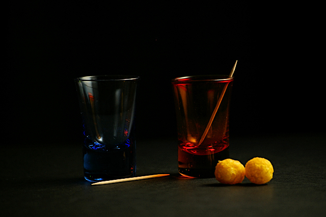
Very dark, would have lost the ball things as then unbalance the composition. This looks more like red/blue rather than orange/blue on my display which is a shame. The red is much stronger than the blue and so further adds to the unbalance. Red tones are visible as reflections in the blue glass which is nice but hasn't worked the other way around - so more unbalance. Apart from the reflection, the blue and red are in the main, seperated from one another by the background and so you lose the high contrast attained from having complemenary colours against one another |





 Add photograph to your favorites
 Add photographer to your favorites


