Author Thread Comments Made During the Challenge
Post actions
Good title , simple and effective 9
Post actions
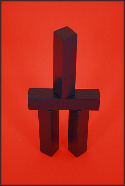
I don't see the complimentary colors here at all. Nice structure and geometry.
Post actions
The colors on the blocks seem a little washed out. Maybe reflecting off the red too much, perhaps. A different angle may heave had more punch. Sorry, this one is just not doing it for me, but I can see some good ideas and effort.
Post actions
Wonderful image, but I'm missing the complementary color (green). The white spots are a little distracting.
Post actions
I don't think these are complementary colors
Post actions
i guess the blocks were blue, but the reflected red light turned the into dark grey
Post actions
missing the complementary colors.....
Post actions
Where's the complement? It may be the lighting, but the blocks look black, not green.
Post actions
Post actions
need to have some green, don't see it on my screen 3
Post actions
I'm only seeing one main colour - red. There is no green.
Post actions






 Add photograph to your favorites
 Add photographer to your favorites


