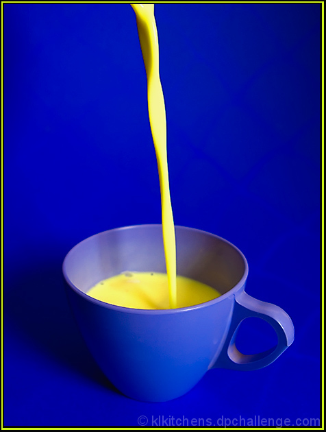
FYI, I *DID* understand complementary colors. The cup is purple, the nog is yellow -- so it fits. I chose the background of blue because it looks so good with yellow, but that seemed to distract folks from the complementary colors within. Oh well... Thanks for all the votes and I definitely learned something from this challenge!
Statistics
Place: 31 out of 172 Avg (all users): 6.0824 Avg (commenters): 5.9091 Avg (participants): 5.3273 Avg (non-participants): 6.4094 Views since voting: 1423 Views during voting: 281 Votes: 182 Comments: 14 Favorites: 0
From the description:
...For those of you who need a refresher, your main sets of complementary colors are red/green, blue/orange, yellow/purple.
Sorry, but you didn't get the colors right.
Colors and subject are fun; I might have moved the cup off to the side of the composition a bit, or tilted the whole thing just to add a bit more interest to the composition.






 Add photograph to your favorites
 Add photographer to your favorites

 Photographer found comment helpful.


