Author Thread
Post actions
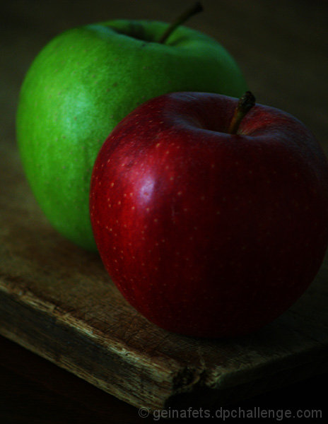
I like the composition of this. Though already stated as a bit oof, this is a strong still life and think an impressionistic type filter would suit this perfectly.
Post actions
A bit out of focus and too dark
Comments Made During the Challenge
Post actions
A bit dark, but the textures are nice - especially the table.
Post actions
Would work better if the red apple was more in focus. It seems a bit soft and the entire image is a bit dark. 6
Post actions
Post actions
I like the composition. Colors are good, but perhaps a little too dim for my own preferences.
Post actions
nice idea and composition. A tad too dark overall, IMO
Post actions
This is way too dark. The composition is good, the angle is good, but just too much is lost in the brightness/contrast of this photo.
Post actions
Post actions
mmmm...
Post actions
A little dark for my taste.
Post actions
Post actions
The picture may have had more impact if the green apple was in focus as the red one.
Post actions
i like the darkness of this image
Post actions
nice composition, but too dark.
Post actions
Quite dull in tone, could have used levels or curves to make it sparkle more. Also could be quite a bit sharper
Post actions
Nice, but maybe cropped in too close, left apples too high. Great light and point of view.
Post actions
I really like the processing on this. Has almost an old-world feel.
Post actions
I think the lack of light created a sort of blur in the apple(s). I think it would've looked better if the apple was a bit sharper (in more focus) and if it was cropped a bit to even the sides out. But great concept and good choice of positioning.
Post actions
A bit dark for my liking.
Post actions
nice concept but too dark.
Post actions
Post actions
A bit more contrast and a bit more sharpness would really help this image pop.
Post actions
colors too muted & focus too soft - 4





 Add photograph to your favorites
 Add photographer to your favorites

 Photographer found comment helpful.


