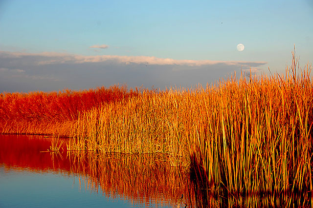
i don't know even I shall comment on any photo seeing that so many controversies going on. But just stopped by to say that I liked the photo. It has something which is not typical of DPC. Looks like a virgin photo untouched by post processing sin. Got me thinking soon you would be doing heavy post processing and this freshness would vaporise.
Nice fresh one it is though.
I didn't vote on the challenge this was in, but it's really nice. Nice crisp colors. this is one of those shots that could have benefited from more resolution allowed in a challenge.
Love scene. I love intense colors, but the reds and yellows are just a touch oversaturrated for my taste. Maybe deepen the sky color to balance it out a smidge. Wonderful composition.
It definitely looks too sharp. That can happen when you have very small details like in the reeds. Just don't sharpen it as much, or lower the default sharpening setting on your camera.
As you can tell from the comments, you can't please everyone on color. Some wanted less red, some wanted more blue. Just do what you like and accept it won't hit home universally.
The final aspect of scoring high is nailing the challenge, and you didn't quite get it right with this color combo. The key is to learn when your score reflected missing the challenge vs. not being a great photo. FWIW, I've been in many more challenges, and I still often miss the point voters are looking for.
i thought the 'red' was orange. orange/blue was what i was going for as my comp colors. maybe i saturated it too much.
i don't know how i got the sharpness. this has happened to me before. (i have taken self portraits and my very 'fine' hair has come out looking like those reeds.) the only thing i did to it that had anything to do with sharpness was use the 'unsharp mask' that was suggested in something i read on this site and i don't even know what that does. i've got a lot to figure out and you have been a great help tonight.
It definitely looks too sharp. That can happen when you have very small details like in the reeds. Just don't sharpen it as much, or lower the default sharpening setting on your camera.
As you can tell from the comments, you can't please everyone on color. Some wanted less red, some wanted more blue. Just do what you like and accept it won't hit home universally.
The final aspect of scoring high is nailing the challenge, and you didn't quite get it right with this color combo. The key is to learn when your score reflected missing the challenge vs. not being a great photo. FWIW, I've been in many more challenges, and I still often miss the point voters are looking for.
Where's the green? (complementary of red) Or if you were aiming for for the yellow and blue, I wish you would have made the blue a little more intense and cropped out most of the red just because that grabs the attention before the yellow does. Great shot though!






 Add photograph to your favorites
 Add photographer to your favorites

 Photographer found comment helpful.


