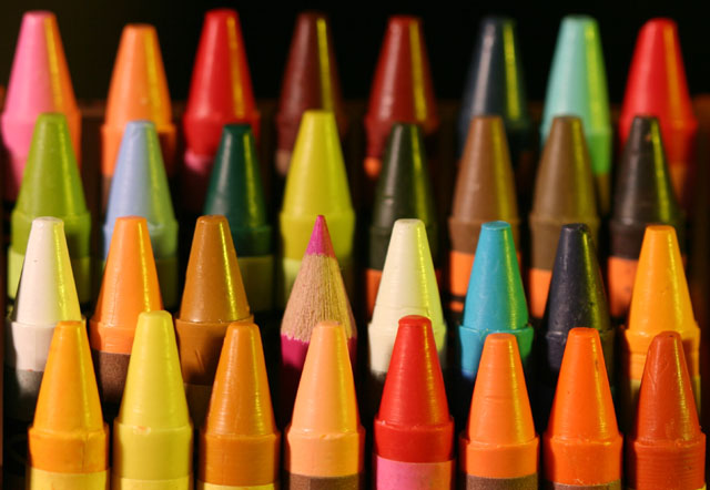
very nice lighting, but there appears to be a little bit of a yellow cast to the image. I think I would have moved the pencil over one spot to the left but then I kinda like where it is because it makes it harder to find.
I like the depth of feild here with the focus on the pencil, however, I think wth white balance could be improved. the yellow cast from the incandescent light makes it look, what? ..unprofessional?
Well done! I'm expecting to see this one on the front page for this challenge. I like the vibrancy of the colors, and the focus works well to bring the attention to the pencil.
Beautiful color! However, I'd have preferred a more careful arrangement to make the pink stand out from the rest. Maybe try putting some lighter color next to it.






 Add photograph to your favorites
 Add photographer to your favorites


