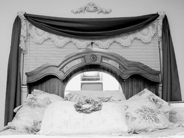
A 1 cuz you may be lazy,a 5 for the layout,a -2 for being out of focus and -4 because I just don't get it.....wait,that's 0...oh well,2 for trying???...no,maybe 3,wait a sec...I see it now......it's a 1,cuz.....I got totally lost in 'your corner of the world'.It looks like a scanned B&B brochure...sorry.I don't mean to offend...that's only my opinion---others may see it differently.
maybe focus/meter more on the pillows, 'cause they're lighter and more intricate, they look just a little blown out. although maybe shooting at them would make the venetian blinds disappear, i dunno.
I just don't know what to say. Nicely made up bed. Something about the wreath on the pillow didn't come through well. There's nothing really horrible about this shot, but nothing really grabs me either. Sorry, 6 Swash
I really don't like the objects reflected in the mirror of the bed post, it's really distracting to me, and I keep focusing on it.. Also, with an image like this, I would have recommended alot of "primping" of the scene, you know puff up the pillows and make everything look "perfect" like in a catalogue. Good effort, just could be better :-)






 Add photograph to your favorites
 Add photographer to your favorites


