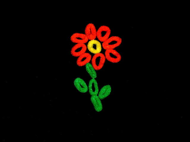
Would like to see less negative space. Cropping closer would really give the viewer a better focus on the subject. Very creative idea arranged to make the subject very interesting. "8"
Seems odd at best to show this in a landscape orientation - of what use is all that dead space? Added to which, the positioning of this design in frame is pretty weak - dead centre is always tricky. Beyond that, this is really a very flat photo - more about the design than the photography - a record, rather than a creative endeavour, if you see what I mean.
Interesting idea and it does fit the challenge well, but it just doesn't light a spark for me. Maybe the compostition with the subject smack dab in the middle doesn't help. Maybe if it was rotated to a diagonal or cropped a little differently... Not sure exactly. It does kind of have a pop-art feel to it.






 Add photograph to your favorites
 Add photographer to your favorites


 Photographer found comment helpful.


