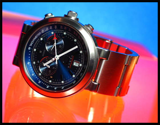
Great picture for a wristwatch advertisement! Out of curiosity, what did you use for lighting/background? To me, the bright color is what makes this shot a great one.
While the face of the watch is sitting in a nice strong location, the watch as a whole doesn't seem to sit comfortably in the frame. I would have tried placing the *entire* watch right int he middle. Nice, though!
Good use of colour here - you've managed ot echo the red of that hand's point in the scene without it seemiung overpowering or plain bizarre - and thankyou from the bottom of my heart for not putting a red line in the border :-) Certainly a mundane enough subject - made it look extraordinary? Jury's out for the minute ...







 Add photograph to your favorites
 Add photographer to your favorites


 Photographer found comment helpful.


