Author Thread
Post actions
Congratulations on your top 10 finish. Beautiful shot!
Post actions
Congrats on your top 10 with this delightful shot Soni! Chandraya has grown so much!
Comments Made During the Challenge
Post actions
good comp and lighting......I like the hair up
Post actions
Great photo, average design
Post actions
This picture is very cute, but doesn't have much color.
Post actions
little bit to clean no? 8
Post actions
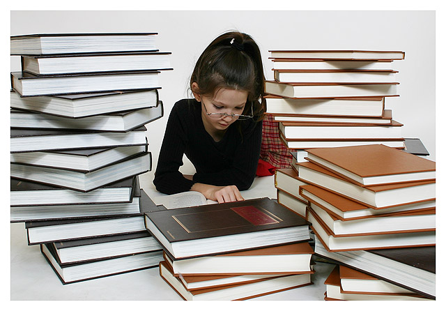
Adorable girl, great concept, and good message.
Post actions
Perfect composition and clarity, definitely my favorite. Good luck 10
Post actions
I really like how the books have the pages facing out. Makes this photo stand out a lot more.
Post actions
cool idea really well done! 10
Post actions
Post actions
Post actions
Post actions
it would have been better if the books showed their titles... and if they were not all of the same color.
Post actions
This Photo shows that with hard work you will reach your educational goals. Great Photo!
Post actions
Technicals: 1.5/2 - sharp; good stock material. a tad too dark: greyish background, no drawing in her shirt
Post actions
This must be the winner - it certainly gets my highest vote. Good luck.
Post actions
Neat, well lit & clean. May have looked even better without thick white border.
Post actions
Wonder how this would have contrasted with the books the other way round? good photo...7
Post actions
Post actions
Nicely done, great comp lighting and colours. 9
Post actions
I like how the books frame her. mixing them up (based on colors) though, might have made it look more random and less set up.
Post actions
Very well composed and lit.
Post actions
Beautiful image, very clear 9
Post actions
excellent - i like the clean look of the books, the white bindings, the white background, and the sharp black outfit to go with the studious young girl
Post actions
nice light and detail...well done
Post actions
nice composition and use of colors, good light. perhaps a bit more zoomed out to get the left side
Post actions







 Add photograph to your favorites
 Add photographer to your favorites

 Photographer found comment helpful.


