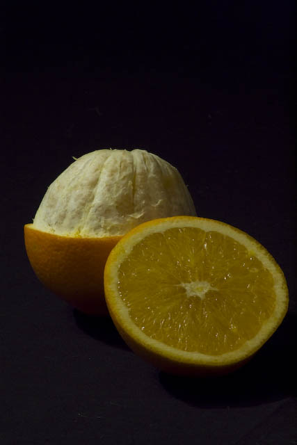
First of all, I like your take on the challenge. The "topless" orange in the background is a very clever idea. However, I'm a bit thrown by the purpose of the orange in the front. It adds another element, but isn't topless itself (or maybe it is?), and clearly isn't the part that was removed from the orange in the rear. This was mentioned by a few commenters below, although others liked the idea. It's your art, so I'm not implying what "should" have been done (only possible alternatives).
Contrast could be boosted in this image, and an increase in colour saturation might have helped (the orange isn't very vibrant). Composition and placement of the oranges is good, although there's nothing grabbing or keeping my attention. Perhaps some really hard light with well-defined shadows might have helped boost interest.
Overall, I'd take the comments you already received to heart. The general consensus is that it's undersaturated, underexposed, and lacking contrast. This type of image needs pop (either via contrast or strong colours) in order to grab the viewer's attention.
Love the idea of actually peeling one and cutting the other one... a contrast between them two. Nice idea and the composition...would be better off with lome light on the object, but still a high vote :)
nice still life concept. i think this would really benefit from adjustment of levels. It has a lot of potential, but needs some assistance with basic post processing to really come across well to the viewer.
And sliced off? That slices off one is useless in the photo.
The line on the right corner is distrating.
Should be less bright (the background) and boosted color a bit.
MAKE THIS INTERESTING FOR THE VIEWER.
Very interesting concept. It is a bit flat and the colours need some livening but I enjoy the concept. I wonder how hard it would have been to get half the peel intact but empty. Hmm.
Seems very under-exposed, or even un-lightened in processing. The illumination of your subject appears fine, but everything is condensed into such a restricted range of brightness that its actually hard to tell. Cropping, or perhaps lack of it, is a touch uncomfortable too.
Neat idea-and I like the detail and the layout of the orange halves. A few critiques-since everything is in focus, it's a little dull. Also-to me it appears underexposed (but different monitors do have different settings). Also-isn't it strange, the two halves clearly don't go together. Also the dark background makes it appear to float, and the underexposure leaves little room for actually seeing the shadows, which make it appear kind of flat.
If it suits, try a lighter background (unless there's a reason you chose this dark one?) and try a larger f-stop (smaller number).






 Add photograph to your favorites
 Add photographer to your favorites

 Photographer found comment helpful.


