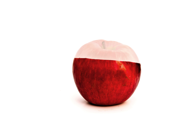
hmm... this is a very clever idea, and well executed! I will admit however that my first impression was not so good, until I read the details. The top almost looks like it wasn't exposed properly, instead of looking like a neat time-exposure trick. Perhaps the viewer would "get it" if there was a little motion streak trailing after the apple top. Just a thought. :) I really like the nice clean light and the rich colors though, and it certainly is a neat idea!
i can imagine this is getting some.....interesting comments...i like the idea but the editing is just too painfully obvious, if you could pull this off with some more convincing pp i think you would knock it out of the park /4
Interesting concept but really doesn't cut the mustard. I think maybe should have gone ahead and cut the top off and set it next to or against, the red looks nice but the fad looks horrid.







 Add photograph to your favorites
 Add photographer to your favorites

 Photographer found comment helpful.


