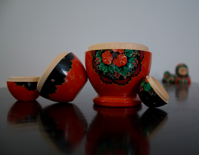
Technicals: As I'm sure you can guess, this is pretty underexposed. You might have been able to save it in Photoshop or another program, but sometimes raising the exposure of an underexposed shot will bring out a bunch of noise. The composition is not bad at all. It is not centered, which is good, and I like the blurred "top" in the background.
The feel: I think it's a creative idea. The composition, like I mentioned, is what makes the photo. I will admit though, that shots of little trinkets and kitsch like this rarely do well on DPC.
This shot has a lot of potential but it needs a few things. Adding contrast with your lighting would help this shot a lot. Also another thing would be making the background either a solid color, or a gradient of sorts. Those two things alone would add a lot. Also maybe try arranging them where they lead to the tops in the background to make that part stand out more, really nice idea.
This is fun, I enjoy how you can see the tops in the background. I think I would have also liked to see the reflection fully. and A bit more contrast and saturation would have really made this image pop and been a contender.
I like this image. Composition is excellent. Reflections at the front are great and the heads in the distance a nice touch. Your problem is with the lighting. It's a bit too dark. Lightening it up will also punch up those colors nicely. Have a play with it in levels and see how you go. Cheers
Very flat exposure this: and from the look of that reflection, rather un-thought-out lighting to go with it. Sense of composition is a bit strange for a set-up image, everything being condensed across one line through the horizontal centre of frame.
Great idea... except i wish you couldn't see them in the background... it kind of takes away from the whole idea of the photo. But great idea anyways...
Chochkys! (sp?) I like your method of display, and the other ones in back. I also love the backdrop choices. That reflective table is beautiful. My only complaint-you split the scene in half. Use rule-of-thirds. If it was my choice, I would have ditched some of the gray background on the top half, and shown more of that beautiful reflective table.





 Add photograph to your favorites
 Add photographer to your favorites

 Photographer found comment helpful.


