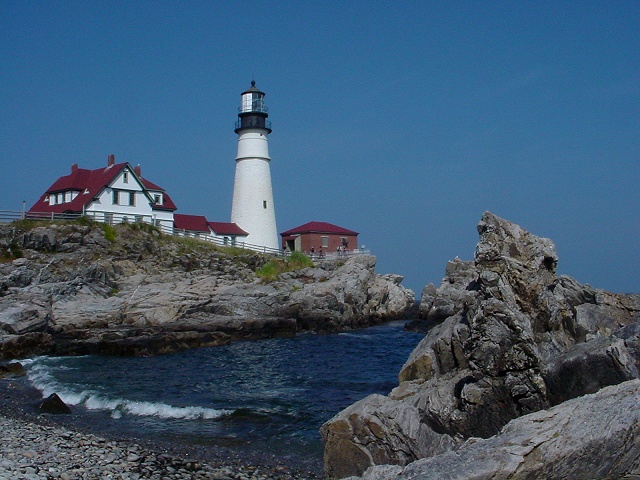
Guarding the entrance of Portland Harbor on the rocky atlantic coast of Maine, this lighthouse has come to be one of the most identified landmarks in all of North America, and perhaps the world. I'm blessed with God's beauty, and humbled to live in such a beautiful part of the world.
Statistics
Place: 22 out of 245 Avg (all users): 6.6443 Avg (commenters): 7.8667 Avg (participants): 6.7805 Avg (non-participants): 6.4776 Views since voting: 1982 Votes: 298 Comments: 34 Favorites: 3 (view)
YES, much better Arnit! Thank you ... what level adjustments did you make? Obviously, you're better at it than I am. Now I'm curious to know if this photo could have been a winner ...
Thanks everybody for your comments! Here are some notes just incase you want to know...
Regarding the levels in this photograph... I took roughly 50 shots of this lighthouse, using different camera modes and settings, etc. This particular photo was taken using "night mode", which generally flattens the light, but provides deeper color saturation and nicer blues. When this shot came off the camera, it was one of the few I really liked, because of the wave in the lower left corner, and a few other reasons. But, it was underexposed!! Too dark... The only adjustment I made was to brighten the photo a bit, but did so without causing the lighthouse to "wash out" because of its bright white.
My camera has no true manual focus, although it does have settings for focal distance. This shot was set on "infinite", and I was quite surprised to find the foreground rocks sharp, but the distant subjects a bit soft... This may have been a manifestation of shooting in "night mode" rather than a problem with focus.
Initial=Very pretty Composition=Well framed and composed - water in the center leads eye in due to the triangular shape caused by the position of the photographer Clarity (focus, details)=Good detail... foreground rock in crisp focus and lighthouse a bit softer... would prefer it the other way around... Not sure how to suggest doing this...just a feeling. Exposure=Well done Interesting or Emotive=Interesting, beautiful colors and mood
I am using a this new detailed commenting method inspired by autool. (Thanks autool!). I hope you find it more helpful than my former comments. Thanks for submitting, and good luck! ;0) kpb
contact your local board of tourism, they'll want this as a postcard, perfect ten, way to get the detail on the rocks in the foreground without losing the lighthouse details, even the wave is perfect, sweet.
The house seems just the tiniest bit fuzzy to me, but I am certainly not marking down for that. I love the composition, and the shot really "takes me there". Definitely one of my favorites. I would love to visit this area sometime, it is lovely. lhall-10
somehow I like this better as a thumbnail than full size...but either way I really like it. the lines show better small, the gentle curve in the lower half. nicely done. crisa58
Great shot, I imagine you will get some folks that will complain that it is too dark but I like the colors and saturation. Very nicely composed as well.
Ah -- I'm a sucker for this kind of shot! That's beautiful -- it should be on a calendar! My only comment would be that it appears to be just slightly dark on my monitor, but otherwise it's still a 9.
I REALLY love this subject and composition. I think this is one of the most well composed photos in this challenge. The lighting or the something here is not right... I don't know if it is a negative brightness adjustment or if it was just not a brightly lit subject... I would definitely score this photo a 10 if the color wasn't so flat... great work... = 8 - jmsetzler







 Add photograph to your favorites
 Add photographer to your favorites


