I should have guessed who the photographer was since you are already one of the few listed as a one of my favourites! For a fairly off-the wall entry 16th is pretty good placing - there is hope for DPC yet...
Wow, I have just noticed this was taken in York - freaky! I haven't been into town in ages, this has reminded me that I must.
Good catch. Nice lighting and composition. The vertical line is straight, but the horizontal is a bit off, indicating maybe you took the picture at a slight angle panning towards the right a tiny bit.
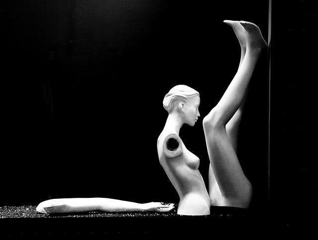
Looking forward to seeing who the photograpgher is and looking throughthe rest of their portfolio! I have come back to this a number of times over the course of voting saving it for last. The composition is superb with a really strong triangular emphasis. The concept is novel, and works so well - I love the way the mannequin is straring at - or past - her own knee. The vertical light on the wall is perfect in its subtelty. The whites on the arm are blown (at least on my monitor)which doesn't really seem to matter - the only tiny thing I would change (which perhaps could be altered under advanced editing) would be to have a bit more definition on the hand. That said, still a 10 from me.





 Add photograph to your favorites
 Add photographer to your favorites

 Photographer found comment helpful.


