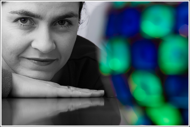
I like the detail and the sharpness of the model in this photo, the composition/ framing. I dont really understand the colors, but they do add an interesting addition to the photo.
ofcourse for the challenge the green-blue thing makes sense, but I just can't see why it's in the photo. for me, only "she" would be better.. just because she looks so natural and relaxed!
The bokeh is pretty amazing - I am going to guess at something like a tea light holder, BUT it is almost like there are two seperate photos here. For me, the bokeh, as it stands, just doesn't compliment the portarait - I wonder if I would prefer it if the colours were more muted?
Not quite sure if the bokeh enhances or detracts. If her eyes matched one of the foreground colors this might work for me, but as is I think the foreground is overpowering the model.





 Add photograph to your favorites
 Add photographer to your favorites

 Photographer found comment helpful.


