Author Thread Comments Made During the Challenge
Post actions
Meets Challenge - 2
Post actions
Could have pushed the tones at the deep end to give it a bit more contrast and impact
Post actions
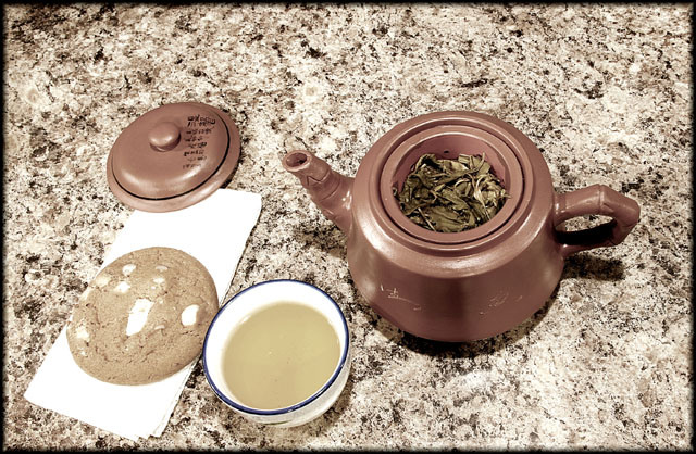
Seems a bit washed out. If thats intentional I don't know that its doing much for the pic
Post actions
Shot looking down at the subject rarely work. Interesting colors though.
Post actions
i like the background, it make a good background which pulls all the rest of the colors together(except for the blue teacup rim). a sweet 6
Post actions
Clarity of details...GREAT!
Post actions
First thing I notice are the bland flat unappealing colours. They all really meld together and does not make anything look like something I would want to partake in. I don't care for this angle, maybe a bit lower would add some depth. The counter top I love it has possibility of really adding something.
Post actions
What ever you used as a backround is very distracting to me. your lighting also seems a little harsh on the left of the cookie.
Post actions
Nice idea and comp but the granite background seems a bit busy
Post actions
it has a weird point of view? maybe better with a different angle
Post actions
nice use of saturation. I like the simplicity.






 Add photograph to your favorites
 Add photographer to your favorites


 Photographer found comment helpful.


