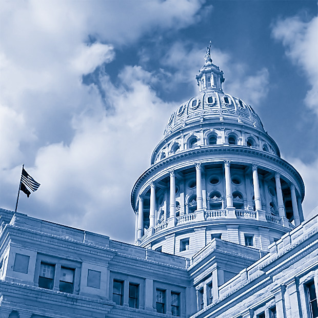
Hey neighbor - great shot! I think that the flags attract too much attention, you could have cloned them, or otherwise minimized their impact on the image. Undervalued IMO.
Great shot, it scored 7 from me (which as ever is the kiss of death for photos in challenges) I REALLY like the fact that you did not tread the obvious black and white or sepia path for this image.
Compositionally wonderful and a sharpness to die for...This has been the effect that I have been trying for when I have shot the old bailey in London and I have never come close to getting anywhere near as beautiful as this
Nicely composed and good tonal range. I'm seeing a few jaggies along the straight edges; you might try softening slightly along those lines after your final resizing to minimize those.
I like the composition of this. Also, it has a nice level of contrast too. I am seeing some artifacting along the straight edges which I presume came from resizing. I don't know your workflow, but I have found that if I resize in small steps it helps reduce that some.
The blue duotone hue is quite dominant. Better tonal seperation between the sky (i.e. blow the sky out to near white) would have made the image less blue overall and more clearly define the structure.
I recognize this place! I even recognize this angle of this place. I like it done in the blues. Square crop makes for a nice comp. A tad oversharpened in places, which is something I find hard to avoid with straight lines.
a popular subject around these parts! I think this would benefit from a little less sharpening, the light/dark halos along all the edges are really quite pronounced.





 Add photograph to your favorites
 Add photographer to your favorites

 Photographer found comment helpful.


