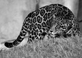
I like the competing textures. I think it works well. It might have worked even better if this was closer, as I think the negative space on the left deters from the image a bit.
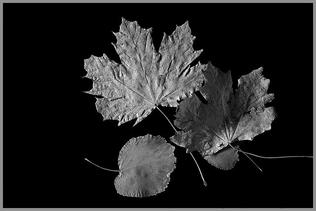
Normally I don't like seeing black & white for subjects that are MEANT to be colorful (such as flowers or fall leaves). In this case, however, I quite like the treatment. I guess it is because of the side lighting, bringing out the texture so well.






 Add photograph to your favorites
 Add photographer to your favorites


 Photographer found comment helpful.

