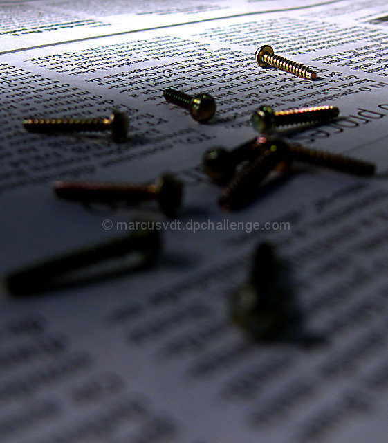
I like the entry and the lighting is really good, except the foreground is dark and distracts from rest of image, i think it may have worked better with the bottom cropped a bit and the foreground a little brighter. Good luck! =)
Would be better it the lighting were better and you cropped in tighter with fewer screws in the frame. Also the paper seems to not have anything to really do with the subject.
I think this is pretty well done, and unlike others, I don't think that the fade-off in the distance negates the foreground effect. Good composition and detail where it needs to be. 7





 Add photograph to your favorites
 Add photographer to your favorites


 Photographer found comment helpful.


