I wanted to stay away from commenting on your challenge images since a) most of them have lots of comments already, and b) they're often inspired by the challenge not your insides.
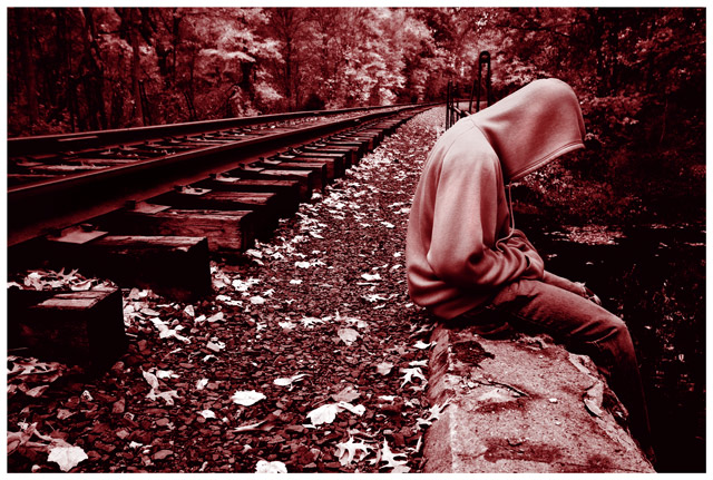
this one caught my eye though. it's good as is, but could be great. I get that it was a duotone challenge, but there's a little too much red in it for me. the colour dominates the photo a bit; lowering the saturation by about 20% would be spectacular. the other thing is the crop. i think this is another case where it needs to be either a bit looser or tighter, depending on the feeling you're going for. as it stands its a bit too far away to be personal, and a bit too close to give that lonely feeling you seemed to be aiming for.
like i said, it's already a good image - has potential to be great. I see a few people below didn't agree with red; blue may have been the more obvious choice, but then again...who says you need to be obvious? ;)
Love the line and the tones but I'm not too sure about the red. I think a blue/gray or maybe a warm BW would suit it better. Bravo on the comp and focus though. Great leading line.






 Add photograph to your favorites
 Add photographer to your favorites

 Photographer found comment helpful.


