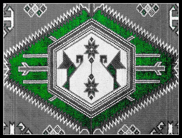
Very nice. Texture doesn't show up a lot though - perhaps a photo from a bit lower down and angled? I can see that you were going more for the image of the design, though.
I'm sorry, I find this the most abused technique around here. In a texture challnge, I can't for the life of me see the point of this selective de-saturation. Emphsising the green - this has what to do with a sense of texture, or'the interaction of light and a three dimensional surface'. 1
That's an interesting choice of desaturation. Would it have been possible to get a different "vantage" point in order to see the textures of the rug better. Of course, the patterns sort of set up a different kind of texture.





 Add photograph to your favorites
 Add photographer to your favorites


 Photographer found comment helpful.


