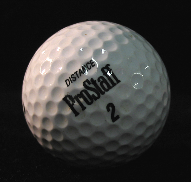
Neat idea, not great execution. The warmer top-side light is effective, but your fill from the right is too general, and perhaps too far to the front of the subject to provide real shaping. Those bright white reflections of the lamps are a shame too - might be worth experimenting with covering them a sheet of paper, to make the light softer, or even to reflect the light off apiece of white board (styrofoam, as the Americans term it, works very well for that. That should give you a more pleasing illumination, and even if there are still reflections, they should have that more professional feel to them. You have caught some texture here - follow the line of the text to the left and it's really quite well shaped there - if you could get that effct everywhere you'll really notiv=ce the improvement, Finally, it's a pretty ordinary subject, no? Great for experimenting with light actually, but in terms of a photographic presentation, not one of the more intriguing things.
A couple of ideas to play around with - more lighting on the left might throw more of the right into black and eliminate the hot spots/glare that distract from the darkness of the right side, there's a lot of writing here - perhaps a ball with less letters would let me experience the ball more.
The lighting brings out the texture, and it also makes the ball look like a crescent moon - a great opportunity for a science teacher wanting to show the phases.
[World Record Attempt]
+ Nice use of light to bring the texture in the viewers mind (it is the first thing that is noticable).
- Focus seems to be a bit of, golfballs have been used many times before, composition isn't quite attractive.





 Add photograph to your favorites
 Add photographer to your favorites


 Photographer found comment helpful.


