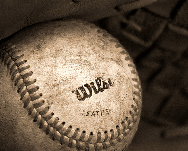
nice colors (or lack there of)... nice detail on the ball and nice lighting. this seems like an image that could be done really bad or really good. you did it really good. good job.
Great closeup of the baseball and gloves. Love the sephia tone, it really makes this composition moody. The dirty really helps to give the leather a worn feeling. I can really see this hanging inside the headquarters of Wilson. "10'
pheww about time a decent image came up - voted 50 and none grab me. Hope you win, everything in this image is great. Very rare for a DPC image to provoke a feeling or two but thisis nice and old and kind of warm. 10 only wish i could give you more. Best of luck.
I like it and I see where you are going with it, but I don’t really connect the photo to a creative interpretation of the theme texture. Not off topic or anything, but I think of sports, somewhere around the 1950's or so... There's something in the picture that makes you think about other things than texture. Choice of motif? Colour range? Don't know and can't exactly pinpoint it... But I like it anyway...
does little for me, this. I'd say your biggest problem is the lighting - you've communicated little or no sense of the feel of the ball - and surely, especially an old ball, ought to have a great feel?
Now this is a real nice pic - the sepia makes all the difference- I think this wouldnt look any better if it was in B&W or coulour - this is the best.
Really nice.
But there is some noise on the right.
[World Record Attempt]
+ Great shot with excellent use of light and darkness that shows us the textures. Your composition is very good.
- Can't think of any.







 Add photograph to your favorites
 Add photographer to your favorites


 Photographer found comment helpful.


