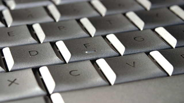
I like it, but (you knew there was going to be a but) I think I'd let the tab establish point of interest and go all sharp on the focus for more texture.
I actually like this - fingers are naturally gravitated to keyboards anyway, and it's partly interactive because i'm experiencing the touch of a keyboard right now! I like how the characters appear raised on the keys too. very nice. 10.
You sure did get the texture on these keys. Good seeing. To make this photo really stand out, it might have been good to introduce another shape or color somewhere in the composition to give it extra interest. Nevertheless, nice work.
The roughness of apparently smooth things :-) The angle is good, and the complex/simple contrast. My eye is constantly pulled toward the foreground keys, and then back to where you've placed the focal plane, whcih makes for a disconcerting conflict in such a minimal composition. I have no problem with the very shallow DOF, but more with the point fo focus you've chosen.





 Add photograph to your favorites
 Add photographer to your favorites


 Photographer found comment helpful.


