Author Thread Comments Made During the Challenge
Post actions
Meets Challenge - 2
Post actions
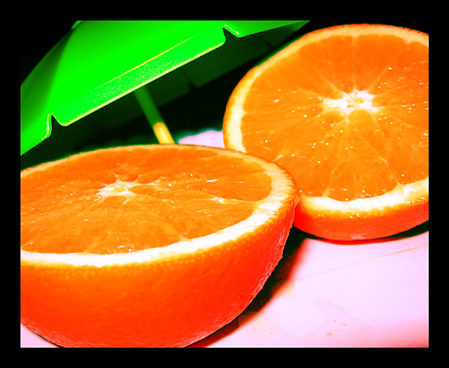
Nice colors, but the focus is off and it's a little over processed.
Post actions
They just jump out at you the color is sharp
Post actions
First thing that comes into my mind is the very strong/thick border. You also have some fairly major chromatic aberration going on; cyan at the back of the scene and magenta at the front, which is not so good and could easily have been corrected during post processing. The oranges are highly saturated and look as if they could be sharper
Post actions
this pic makes me hungry for some juicy fruit...
Post actions
The saturation level is perhaps too high and some more focus would have helped..
Post actions
In my opinion it's overexposed.
Post actions
looks like the saturation was pushed too far maybe, they look tasty tho! /5
Post actions
I have been saying push saturation on many images, but here I think you pushed it too far. Also, im not really sure this is topless? interesting.
Post actions
The colors....superb. The orange looks juicy!! Does it meet the challenge...i dunno!!!
Post actions
Yikes! A litte overdone on the saturation boost there. Tasty looking orange though. Makes me hungry for one :)
Post actions
Fun, but a little over-saturated for me, leading to some loss of definition.
Post actions
Not sure if i like the color on the bottom of the oranges. It looks a bit off. 5
Post actions
Phew. Really oversaturated...i guess thats what you were going for? but you lost all the texture on the orange peel.
Post actions
The composition is great, but it seems a bit over saturated.
Post actions
lighting is way too harsh...colour is nice, but crop is too close and the focus is no where in particular
Post actions
I like the idea, but it's eitther overexposed or overprocessed. I like bright and vivid colours, but these ones hurt my eyes. And the white in the front has a pinkish cast, probably your whitebalance was off. Furthermore, I dislike the big black frame.(3)





 Add photograph to your favorites
 Add photographer to your favorites


 Photographer found comment helpful.

