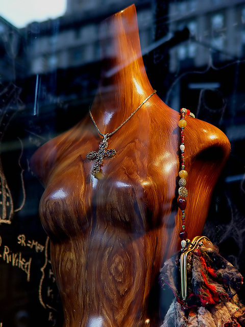
I'm very surprised this did not get a ribbon or place within the top 10 at least. I gave it a 10. It's funny how people see things so differently. When I look at this picture, I can feel the smooth polished wood, the sharp metal of the cross, the varying textures of the beads, and the tactile feel of the purse. I can even feel the smooth cold glass of the store window in front of the mannequin which is evident due to the reflections. I love the color and composition too. This is still one of my favorites in this challenge. I think you did an excellent job.
Good subject; generall well captured, however, a polarizer might have gotten rid of the reflections and then you could have captured the nice wood texture (or you might have gone in the store).
Nice contrast of the blue world and the warm colour of the wooden figure - like imagination and reality in a drear world. great sense of the smooth polishedness of the figure too, and the highlighting of it works well. Do like this very much.
Unique idea here - bit of glare but it's not directly on your subject. The blue tints everything and the wonderful wood/brown colors are muddy because of it. I don't know much about filtering that out but I'm thinking that playing around with the color adjustment could eliminate some of it.
Favourite! Nice colours, very sharp and clear. The reflection on top first annoyed me. Then I realised that adds a kind of mistery. You can feel the cloudy day outside
Relfections are very distracting. If that was an intentional part of the texture, then it is too much competition among focal points to keep my interest.
I like this one, the reflection in the window is very cool, and the lightning on the lady is very good againt the black backgeound It all runs smothely together - 8





 Add photograph to your favorites
 Add photographer to your favorites

 Photographer found comment helpful.


