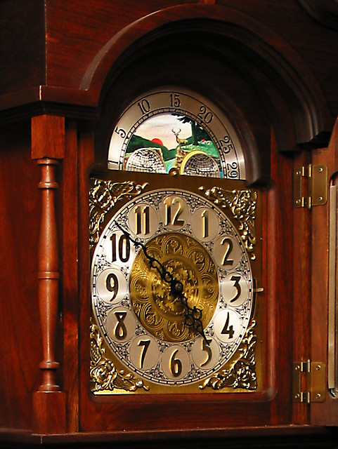
A grandfather clock I was shooting essentially to check lighting for a portrait near the clock. While reviewing my shots, this one seemed to fit Textures II. It has been treated with, crop, USM, and tone curve.
Statistics
Place: 325 out of 406 Avg (all users): 4.5358 Avg (commenters): 4.6154 Avg (participants): 4.4695 Avg (non-participants): 4.6436 Views since voting: 1086 Votes: 265 Comments: 13 Favorites: 0
Some impression of the quality of these surfaces, though really quite an ordinary illustration of the clock face. Lacks that dynamic that comes from good lighting, from a less straightforward approach. Good exposure, and accurate colours and sense of the object itself, but the shot hasn't placed the emphasis on the textures really - would need more careful consideration of the affect of light on a surface in that area.
Too much to look at. Get in closer and choose a main subject to focus on would really improve this shot. A famous photographer's theory was that if his pictures looked too static, it was because he wasn't close enough.





 Add photograph to your favorites
 Add photographer to your favorites


 Photographer found comment helpful.


