Author Thread Comments Made During the Challenge
Post actions
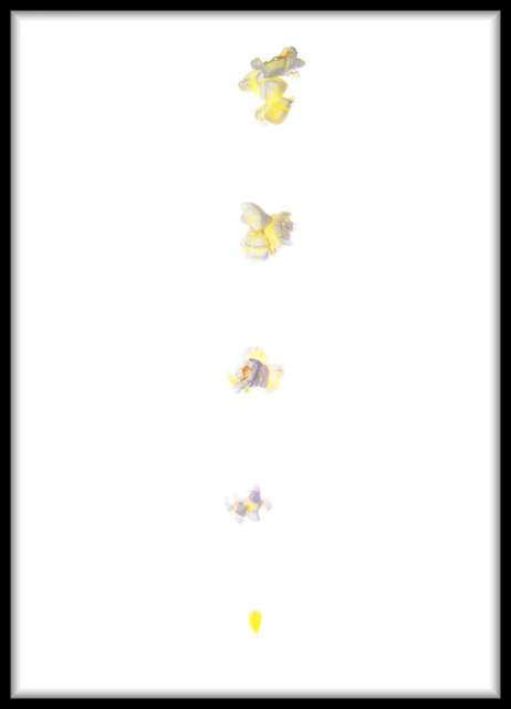
its a shame that this is so dang bright
Post actions
Its over exposed and that makes it hard to see the picture.
Post actions
i really like this idea and the composition but the white background is overbearing imo.
Post actions
The white is a little too blown out for me. The brightness of the shot distracts from it.
Post actions
Post actions
a bit more contrast with background would have helped
Post actions
A little washed out for my taste as you lose some of the popcorn with such a white background. Black or a different color would have helped immensely. But great thought and creativity.
Post actions
Good concept. It's kind of washed out.
Post actions
I like this idea, however, I think the popcorn would have more definition on a darker background.
Post actions
It's hard to see the detail. I'm not sure if it just needs to be viewed at a larger size or if it's a case of too much over exposure. I like the concept though! Good luck.
Post actions
Great idea, but the kernels are too blown out in my opinion. An overall good effort though - 5
Post actions
Fantastic idea, but I think it's a little too blown out for my liking!
Post actions
too bright, not enough detail
Post actions
I'm having a hard time seeing the stages, lighting is way too bright!
Post actions
Love the concept here, don't like the white background. The popcorn blends in too much.
Post actions
Would have been a great photo if the background was some other color than white so that the other colors would show up more abundantly.
Post actions
Too much white here, it kind of feels like everything is blown out. Try the same thing on a black background. Also see what it looks like if the progression is moving diagonally across the frame, rather than right in the middle moving straight up.
Post actions
I do like light-on-white images, but there needs to be a touch more contrast to make this really compelling.
Post actions
Nice. Bit oversaturated though. (6)
Post actions
Would have made more sense if it was actually in a circle, but other than that it's very creative.
Post actions
good idea but wish you had used a different colour for the background as i feel it is sore on the eyes
Post actions
Wish there was a little more contrast between the background and the popcorn.
Post actions
IF YOU HAD MADE A CIRCLE IT WOULD HAD BEEN BETTER
Post actions
Too much bright light. I can barely see the subjects. It was a great idea though.
Post actions
I tried to view this shot on two different monitors and it still looked over exposed. Nice idea though
Post actions
Might have been a bit better on a black background...
Post actions
the idea is sound, but the other picture with the idea was better. too much white on white leading to overexposure. Reshoot with a different background
Post actions
neat idea but too overexposed for me its hard to look at/see the detail
Post actions
a bit on the overexposed side...





 Add photograph to your favorites
 Add photographer to your favorites


 Photographer found comment helpful.


