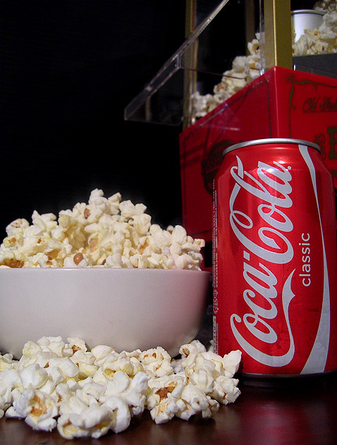
A classic combo. . . or something like that they say at the theatre. Well executed. A bit of glare on top of the Coke can, but nothing worth losing score for. Nice job and I really like the composition.
Nice sharp image. The main thing holding this back is the composition. It's just not engaging enough at this angle. Perhaps a slightly raised view with a diagonal composition might generate some leading lines to guide the eye.
Nice popper :-) Good choice of elements to convey your idea without making it too busy (the Coke and popper both being red is nicely harmonious so the popcorn isn't overwhelmed).






 Add photograph to your favorites
 Add photographer to your favorites


 Photographer found comment helpful.


