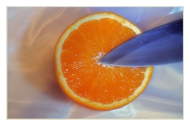
I like the background material you have used. Overall, the composition feels a bit unbalanced to me. I think it might be effective if the orange was further to the left, and the blade was more at an angle toward one of the corners of the picture.
This would have been a lot better if the orange was farther over to the left, an we could see more of the knife. There is also a lot of detail that I don't see on the orange, its probobly hard to get the lighting right to get that texture to stand out.
Nice subtle colors, and I like the simple composition. My two comments are about the lighting... the shadow is cast upwards, not a more natural downwards. Could you have rotated the whole scene 180 degrees and re-shot, then flipped it? Also, the left edge of the orange seems to be in shadow, perhaps tilting it ever so slightly would have brightented it up or even added a hilight.
[World Record Attempt]
+ Good framing and cropping. The knife brings appeal to the photo. The various layers: knife, orange, cloth are great.
- Can't think of any.
There is some sense of a variety of textures here, though I don't know that they're actually shown rather than just emphasised by the familiarity of these things. Composition is static - nowhere for the eye to wander around the frame, and it seems an odd choice, with this set-up, to place the orange so centrally.
Yum! The texture of the orange comes through very well.
I think I may have considered cropping a bit of the left side if it was me. But it isn't. Good one! 9
Nice take on interpreting the challenge. Quite good texture in the orange and the knife helps add interest to the composition. If it was mine, I'd probably crop a tad off the left to get that orange out of the center, but it's not mine, it's yours; nicely done!
Nice picture, the colors are very cute, looks like it could be a bit sharper though, you should put something white in front of your light source to awoid white spots in your subject, good luck





 Add photograph to your favorites
 Add photographer to your favorites


 Photographer found comment helpful.


