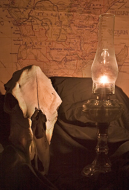
This is a great idea. For me, there are a few problems that really hurt this shot. The black cloth is too much - goes up too high on the map, and there is too much of it visible. In addition, it hides the base of the lamp. The skull is dead-on to the camera (probably would be better at an angle), and the proportions between the skull and lamp are too close in size. I like the lighting and antique look. My wife says the lamp is too fancy when compared to the rest of the shot.





 Add photograph to your favorites
 Add photographer to your favorites


 Photographer found comment helpful.


