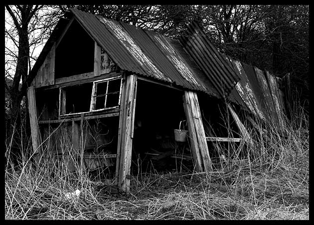
Taken at the same time in the same place as my Elements submission. Saw this old shack and knew I would shoot it regardless.
Along came the texture challenge and I shot a few close-ups, but liked the whole building better. Although it's full of textures which i find great, it's probably 'not close enough' for some.
I love the way the grass gives it some extra oomph. Only thing I am not happy about is the burnt out sky. It was quite overcast which is what I wanted and could have underexposed a little to darken it but my textures would have been ruined.
Who knows...will wait and see ;)
Note: This is rare, me submitting my type of image, this is what I love to shoot. Same goes for elements so fingers crossed on these two.
Thanks for viewing and reading my drivel.
Statistics
Place: 165 out of 406 Avg (all users): 5.2786 Avg (commenters): 6.5556 Avg (participants): 5.1552 Avg (non-participants): 5.4811 Views since voting: 1164 Votes: 280 Comments: 12 Favorites: 1 (view)
This is one image I missed - had much, much higher (in my top 10 or so). Guess the masses assumed texture demanded a macro or the like. There were others, so maybe I'm just out of touch? Dunno. In any event, I liked this shot - great feel to it.
Black and white is a good choice, lots of texture here so you meet the challenge, it's a bit dark but on the other hand that conveys a mood, so if I were to change just one thing I'd make the black frame thinner (with perhaps a white line between the frame and the image. This kind of subject is one of my favorites and I like how you've done this one.
Interesting texture idea, nice choice of B&W. I feel there are too many elements in the shot that are distracting to notice an specific texture. Maybe another POV would help that.
Great black and white with a vintage feel. The darkness, the light, the white window frame, the bucket, the collapsing supports....everything is just right. 10
Title matches perfectly but the picture does not represent the challenge very well. Don't get me wrong it is a great photo by all means, but it would probably would do better in a different challenge.
Splendidly battered subject. Good work on the looming out of the trees trick, great exposure for me too (I suspect many won't like the darkness) Works very appropriately in black and white. Doesn't quite do the texture thing, in a oure sense - I don't get a strong sense of the feel of the thing, rather of the look and location, and of course a wonderful mood.
Good texture. I've just never been a fan of old falling down buildings, but they seem to be a great subject for a lot of photographers. The black and white works very well here and I like the simple black border. Some people might thing the contrast too high, but I like it this way.
Plenty of texture here! Well done with nice balance between lights and darks. Um, the image is strong standing alone so it probably doesn't need that thick border.







 Add photograph to your favorites
 Add photographer to your favorites


