this could have been a 'knockout' if you had placed that jub off to oneside (perhaps on a 3rd line). Also if a contrasting shape could have been introduced it would add to the composition. Still, nicely photographed.
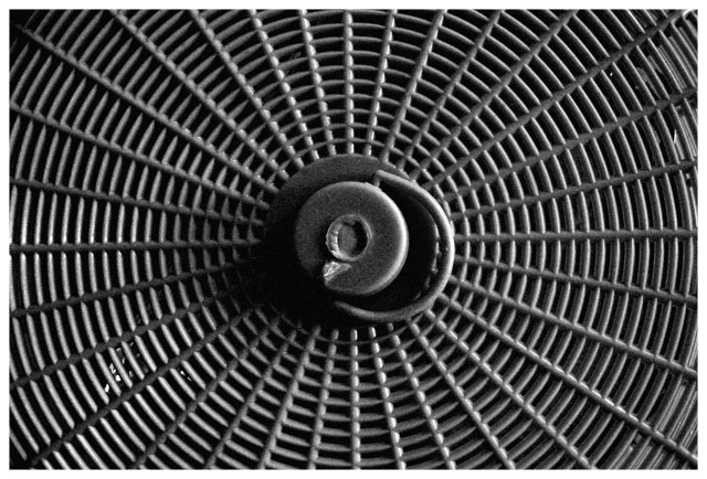
Intriguing pattern - and shows good understanding of the ideas behind regular and rhythmic compositions such as this - even allowing the handle to break that pattern is effective. Touch of brightness lower left is amazingly distracting for such a small area, thugh it's a function of the regularity of the patterning. Get some feeling of plastic from the image, but mutedly so. Nice work.
You should have put the middle of the web on one of the thirds of the photo (rule of thirds). You should have tried to be a little more creative with your perspective, and composition, but the photo has potential.
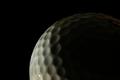
I see the texture. Composition is good for the subject. Just no real interest here in the subject. Lighting is okay, but maybe more contrast would add interest.






 Add photograph to your favorites
 Add photographer to your favorites


