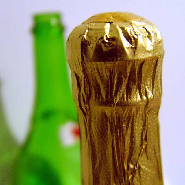
Vertical placing within frame is good, allows the eye to remain concentrated on the wrap of the bottle. Do find it's not being properly vertial annoying, and the relative placing of the bottle in the backgroundcrowds it a little - a touch more gap between the edge of that bottle and the edge of the gold would not crowd the gold so much.
[World Record Attempt]
+ There are textures.
- The green bottle is distracting at the moment; this can easily be solved by moving it more to the left. Focus seems to be a bit off but perhaps this is just me. There is a little overexposure noticable.







 Add photograph to your favorites
 Add photographer to your favorites


