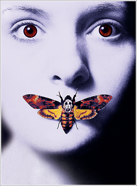
self porty. This was fun! I hope it does pretty good...I worked really hard on it. ;)
***WOW!!! My first ribbon! I'm so excited! Thank you so much, everyone...for all your wonderful comments and votes. I would never have been able to do something like this without being a part of the DPC community for the past year and a half. Thank you, THANK YOU!
And a big thanks to Ursula for being my mentor. :)
To answer Posthumous's question, I took the picture in my house with one light coming down at an angle to create the same shadows as the picture. The butterfly was the same moth from the poster, I just printed one out and taped it over my mouth. I overexposed it a bit. In processing, I clipped out the eyes and butterfly. I turned it to grayscale, then duotone. I used a lot of curves, added some grain...did some burning, cloning of specks on the face, some hair in the way... I added the eyes and butterfly back in, and increased saturation- used some selective color...sharpened... I may be forgetting some steps...but that was basically it. ;)
Statistics
Place: 3 out of 83 Avg (all users): 7.2819 Avg (commenters): 8.0270 Avg (participants): 6.5111 Avg (non-participants): 7.4725 Views since voting: 9957 Views during voting: 686 Votes: 227 Comments: 86 Favorites: 7 (view)
I'm one of your fours. This looks nothing at all like a photo to me...or a scene from a movie...although I didn't vote it down for that. It makes a great poster, though, and you did a great job in post processing. Just way too much pp for me.
Adding: Just way too much pp for me for a photo contest.
Fantastic shot!! Many congrats on your first ribbon! Those lucky pants have been pretty lucky around here lately...hope I can start getting some shots soon too, and catch up with all the success!! :D
This is quite fun and fairly well put together. I would have liked to see a bit more balance, the image seems to fall moreso on one side than the other. but a very nice job all the same.
Beautiful representation/duplication of this infamous poster/marketing program. Very well done. The noise is just right and the tones are terrific. The bug looks a tad bit on the "papery" side (cut/paste), but it's a very minor distraction. Excellent work.
this is my pick for the blue, it's amazing. the editing is spot on. it looks just like the cover. i really hope voters don't get trollish on this since it's not a 'scene' from a movie but rather a cover. i gave it a 10. great job!
Wow .. that is fairly accurate. I went to imdb.com to compare. The eyes of the person used are a bit wider, but in a way bring more to the photo than the original. Well done.
Excellent, one of my favourite films as well. Imagine you might get shot down by the DNMC parade as this technically doesn't recreate a scene but you get high marks from me.
I just googled the original image, and this is about as close as you can get. It must have taken ages and lots of work to get this just right. Great post-processing as well. I love it!
Man - that is perfect. I thought of how would you do that and you did nail it. It really isn't a scene from the movie, but the poster they used for advertising, but you sure got that right.
This is almost TOO well done - I've spent the last 10 minutes look to see if you just entered a photo of the poster! Anyways, I don't think you did but your attention to detail is outstanding - the shadows, grain, catch-lights, colour, expression... unbelievable!
I hope the DMNC police don't get upset because its a poster and not a scene as such. Its amazing - 10 from me
Incredibly true to the original. In act, I had to find the original to see if it was stolen :P I like that this version has her eyes a bit more frightened. I hope this ribbons, you did a fantastic job with this.
well, what to do here. It's not a scene, but a poster, but you did a pretty good job. I'm going to assume the moth is the only cutout here. I'll give it a neutral 6.







 S I L E N C E O F T H E L A M B S
 Add photograph to your favorites
 Add photographer to your favorites


 Photographer found comment helpful.


