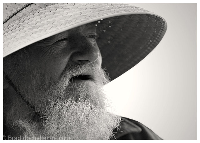
I am not familiar with either versions of the movie so I am just going to give you the benefit of the doubt and just judge this on the composition & technicals (plus I couldn't find any photo matches on Google:-) but that does not mean it does not exist just that I cannot make a good comparison) Let's see lighting is very good and it illuminates your subject very nicely. We see many sharp details from the individual hairs in his beard to the crow's feet around his eyes. His eyes - now there is where I would have liked to see more off. Yes, he has the squint that many fisherman have from avoiding taking in too much light glinting off the surface of the water, but I still think a bit more of the whites of his eyes along with more of the pupils visible would create more visual impact. Eyes are the window to the soul. The B&W tones are good but could be even better if there was a stronger contrast between the highlights & shadows. Bumping up contrast and playing with the Highlights/Midtone/Shadow levels in PP would give this a greater and more dynamic range of tones.





 Add photograph to your favorites
 Add photographer to your favorites

 Photographer found comment helpful.


