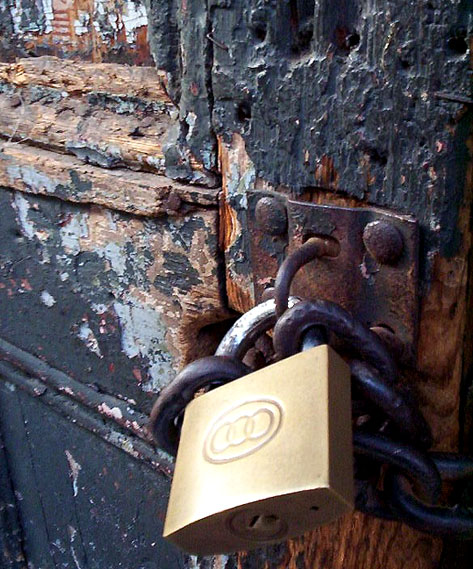
Good entry. Would have been improved IMHO by leaving out the padlock. alternatively, keep the padlock in but improve the focus on it - it's not in focus and is a bit washed out so ends up as a bit of a distraction from the wonderful worn wood and metalwork. 7
Very nice shot, I wish the texture of the lock hadn't blown out, it would have helped the contrast with the door greatly. A bit of spot editing and this is a winner.
Good kind of subject for this challenge - i quite like both the contrast between the wood and the padlock, and the similarity between the wood and the rusted hasp. The light is perhaps too general to really illuminate the texture, but its present in the peeling of the paint and the rust on the hasp.
I'm thinking in terms of B&E... Don't tell the police that, though. As for texture theme - I see where you are going... When I look at it I think old and new...
Another super rust picture with the perfect foil of a bright smooth lock to make a good contrast and keep up the interest. While the lock could have been in better focus, it still was nicely done.
Good texture, nice colours. The lock, somekind, spoils the picture. Too new and too shinny and does not creat the idea of old and new opposing (at least not for me)
Solid shot - to improve it, (imho) I'd vary the light to add more depth to the cut up wood and treat the shiney lock differently (either crop it out or change the lighting to make in interesting)
Very, very nice. Like this one very much. Conveys nice texture and character, neat colors and composition. Lock could maybe have been a touch sharper with a touch wider DOF. Could easliy end up a ribbon winner in my book. Great job!
Ahh.. beatuful door you have here however the composition doesn't do it justice in my opinion. The prominent element in this composition is the padlock and not the beatuful wood. Good luck





 Add photograph to your favorites
 Add photographer to your favorites


 Photographer found comment helpful.


