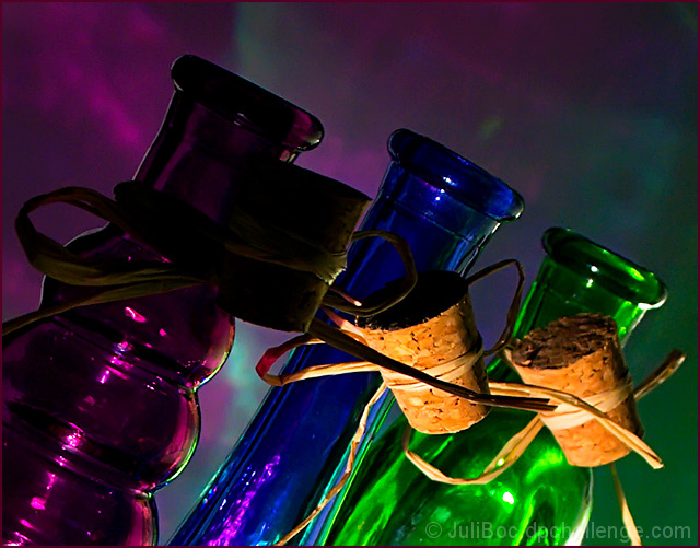
Colored bottles lit by a flashlight in front of a toilet tank. I'm very happy with the result of this shoot. I got exactly what I wanted: the colored bottles with a wonderful abstract colored background. One regret is that the bottles are of such cheap glass that I couldn't get nice smooth clear reflections.
RAW conversion: white balance (tungsten), auto exposure.
PP: crop and rotate, USM, auto levels, Noiseware, flip horizontal, curves, saturation, exposure, NI, brightness, border, resize, save for web.
Statistics
Place: 42 out of 199 Avg (all users): 5.7840 Avg (commenters): 6.1667 Avg (participants): 5.3333 Avg (non-participants): 5.9259 Views since voting: 1235 Views during voting: 272 Votes: 213 Comments: 13 Favorites: 2 (view)
Very nice color palette. I like the different textures of the bottles. Normally I am not a fan of tilt, but here it works because I think it puts more emphasis on the uniqueness of the bottles as well as upping the energy level.
This is so pretty! I was one of your 7's - it was the color that sucked me in :)
I personally loved the color in the background - that is my fave part of your picture. I know that people seem to want some order in these types of shots, but what I liked about it was the disorder. That makes it seem more real and natural.
Very artistic finish to this photo,those that knocked about the 3rd cork not being lit must think light goes round corners, with the splash of light on the cork tie shows there was light on the other side as well.
Thank you Brian. I lit it this way on purpose, and it is part of what I like about this shot. The takes that had all three bottles lit equally were a bit boring (IMO).
Very artistic finish to this photo,those that knocked about the 3rd cork not being lit must think light goes round corners, with the splash of light on the cork tie shows there was light on the other side as well.
with the texture of the cork on the bottles was more distinct; strong light on the bottom right, combined with the falling composition weighted toward the same quadrant makes this seem unbalanced with a lot of wasted and/or uninteresting space in the other quadrants





 Add photograph to your favorites
 Add photographer to your favorites


 Photographer found comment helpful.


