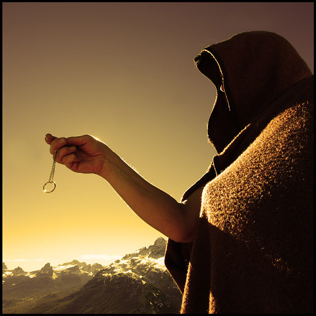
the best LOTR shot, and mine was one of them. love the lighting and the background. very nicely done. my only critique is that the ring looks a little big.. 8
I enjoy this idea, but a few things I think would have made this stronger. For one a wider band to be the 'ring' The way it looks now, it seems like a keychain ring. Also, I would have liked to see the arm out more, or more emotion from holding the chain. The way it looks now is as if it doesn't matter much. Just a ring no biggie. In the movies, most the characters held the ring with fists, or the chain with a closed fist. The ring is power, but I do not see the power here.
"It is a strange fate we should suffer so much fear and doubt… over so small a thing. Such a little thing," states Boromir. First off, kudos to you for tackling such a visually stunning movie. Any scene would be very difficult to tackle (I thought of several myself but quickly wrote them off as not possible). Yet you rose to the challenge and created a fairly good rendition of the scene. While the composition has several elements that differ from the movie scene your emulation is still recognizable as that scene where Boromir picks up the ring after Frodo falls in the snowy mountains. I do like that you have captured the snowy mountains to act as the backdrop in your scene re-creation. However I think the lighting and tonal color are detracting from the visual impact of the photo. The gold/yellow tones are typically warm tones - it goes against the feel of the environment setting in the movie. The regular colors and the very snowy backdrop convey a feeling of cold and chill as they travel through the harsh, and cold terrain. The warm gold tones conflict directly with conveying that harsh & cold terrain in which the Fellowship travels. Not only that but the gold/yellow tones take the focus off the main element in the shot: The Ring. It is the Ring whose deceptive gold tones that should be the sole dominate gold color of the scene. The pose of the model as 'he' holds up the ring is a good emulation of the movie scene but the light falls a bit too harshly on the chest portion of the cloak and it then falls into shadow as the arm holding the Ring up has it's shadow cast. A bit more even lighting to illuminate Boromir so that there are no blown highlights or deep shadows to distract would improve the visual of the composition. Admittingly it would be better if we saw Boromir's face, but he (or she) may not have enough of the same looks as the actor, Sean Bean. Nonetheless, if your model bore enough of a similiar resemblance (hair & beard) to the actor the facial expression could carry the day. Now the Ring. I love how you captured a nice gleam bouncing off of it. It calls attention to it and gives it a little more visual interest. The other critique I have is that in both the movie and the books the Ring is described as being a heavy burden (both physically if you remember when Bilbo drops it before leaving Bag End it has a very audible THUMP which was done on purpose & spiritually). Admittingly, the devil is in the details but I feel it would be visually better if the Ring does not appear to be blowing in the wind as seen by the angle is hangs. A straight line angle that is 90 degrees to the ground would show subtly how 'so small a thing' is so heavy and holds much power.






 Add photograph to your favorites
 Add photographer to your favorites


 Photographer found comment helpful.


