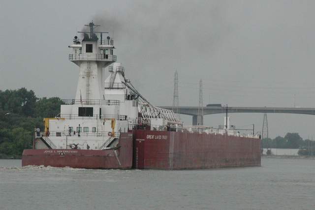
When I look at this image, what I primarily gravite to is the boat. Because that's primarily what this image communicates. And so it begs the question, is this boat your corner of the world? And if not, then I'm going to suggest the lower marking received are in part because this perhaps isn't the best representation of... well... your corner of the world.
Beyond that, the absolute gray of the moment you made this image makes it seem dull to me, lifeless, and makes me wonder how much more impact the image would have had were in shot on a different day and in different light -- the lighting we choose will either make the ordinary bland or the ordinary extra-ordinary.
On a good note, however, it is a relatively clean image. That is to say, I don't find it over cluttering. So that is something in your favor.
But in the future, pay more attention to the light. Because doing so can make the ordinary...well... extraordinary.
The colors seem a little flat to me, though I like the composition and framing. Did you try playing around with saturation or brightness/contrast? karmat
I really like the composition, but the color is a little washed out. Perhaps another opportunity on a sunny day would have helped to get the red ship to stand out a bit better.






 Add photograph to your favorites
 Add photographer to your favorites

 Photographer found comment helpful.


