I was looking at a "Complimentary Colors" challenge knowing that I wouldn't be able to participate because I am colorblind. But a chart was provided listing what colors compliment what.
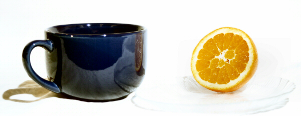
And I knew that I had some blue stuff and the orange color to me was obvious. Use and orange!
I had two set-ups with this. The other had a black background. That was an ok shot, but somewhat boring and unimpressive.
There were several shots taken of this one, but again, I wasn't happy. The orange kept coming out looking flat and lifeless. So, I lit up the pen light and during the exposure I ran the light over the face of the orange. I was happy.
With the 500w floods the image was almost a High-Key image right out of the camera. Added just a bit of brightness, cropped and I was finished.
Statistics
Place: 131 out of 169 Avg (all users): 5.0438 Avg (commenters): 4.6667 Avg (participants): 4.8351 Avg (non-participants): 5.3651 Views since voting: 1114 Votes: 160 Comments: 11 Favorites: 0
It's a neat idea, the focus is clear and the subjects are mundane so it fits the challenge. Two things I should mention: (1) The white background is overexposed as well as the plate where the orange is on, the plate completely lost any detail. (2). It looks like your lighting source is above your subjects. Are the lighting sources of not equal intensity? I say that because the shadows are not the same. Or it could be because the plate is clear and the mug is dark. 5
The plate seems to be overexposed. This was a tough shot or maybe it's the bright illumination that is making it tough to capture the plate. Might have been better without it. I also do not see any teabags or other suggestions that actual tea is supposed to be in the cup.






 Add photograph to your favorites
 Add photographer to your favorites


 Photographer found comment helpful.


