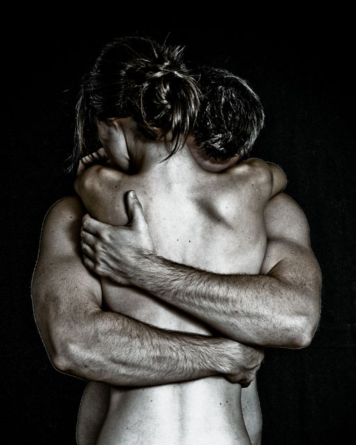
After challenge: The title came from my model. I couldn't think of anything that would convey some emotion. There really is no meaning behind it but I kind of liked it.
Second day with my strobist set up for lighting: Shoot through umbrella off to the left with an SB24 at 1/4 power and an umbrella off to the right with an SB24 at 1/16 power. Models are me and my girlfriend (who tends to show up in all of my pictures). Cheap black fabric for the backdrop. Flashes triggered with the V2 cactus and shutter remote triggered. Processed in Lightroom and resized in Photoshop. I like the processing but I'm not all that happy with the outline cast around the bodies. However, I couldn't get one without the other...oh well.
Statistics
Place: 59 out of 521 Avg (all users): 6.3840 Avg (commenters): 7.6667 Avg (participants): 6.3646 Avg (non-participants): 6.4483 Views since voting: 1992 Views during voting: 339 Votes: 125 Comments: 20 Favorites: 10 (view)
This is a great, emotional shot, and I think the title fits perfectly. They look like they (well, you) have a very tight grip on each other, like one of you is heading off to war, or moving across the country, or whatever. Maybe it's my own experience of something similar (we survived the distance and now have been married for 14 years!). I also really like the shapes of both of your bodies - interesting details that only come out under stress. My only suggestion would be to brighten the hair on both of you a bit to help separate your heads from the background.
How did this not score higher? I know 59th is nothing to be ashamed of, but still I thought it would be better. I loved this capture. Very tastefully done. I didnt' really like the title because I like the idea of true love forever so I just ignored the title :-)
This is a great photo and I will rate is a such, probably 8-9, but I'm curious about the title. Nothing in the photo explains or suggests anything final, yet the title states "The Final Embrace". Something to suggest final, a subtle prop in the frame but not in focus for example, would really help if you want to tell a story here. Great work... but the title has left me wanting even more.
Wow, even if it does look a little like an Athena poster! Bit too much negative space, I'd have cropped it tighter. Shame her back is slightly overexposed. There is something unsettlingly homoerotic about this though! Perhaps I would personally have liked an attempt to portray the woman with more softness or femininity as a contrast, but that's just me.






 Add photograph to your favorites
 Add photographer to your favorites


