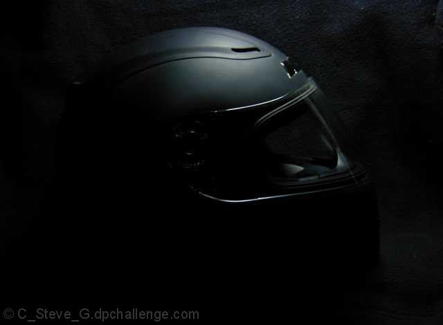
I have looked at this particular photo on 6 different monitors and the difference is dramatic, from quite nice to - not quite so nice. The comment below from Beryl may help you feel more confident about your future submissions as you have no control on the gamma settings any other viewers/voters are using.
Big Steve, Rusty made the comment below while I was logged in & was worried about what you would think. I told her 'no problem' & that you would probably have guessed as much because all of the spelin' was correct(DUH). Gamma calibration is critical for sure, it's dependant on the the viewers setting which you have no control of and your setting when you prep the photo for submission. Consider doing a screen capture of the calibration bar located in most of the viewing screens on the site. Calibrate you monitor for 'submissions', if it is diferent from your viewing preferance.
Didn't get a chance to vote on all of them. Nucks! I am not knowledgeable enough re. photography to make a critique of Black Hat - except that I like it. Boogity, Boogity, Boogity with your next entry.
Steve...sorry I missed voting in this challenge. I would have given this shot a 7 because it fit the challenge very well, was well composed, and I think the lighting was also very good.
A little more light on the bottom and rear of the helmet might be better. you should've also moved the helmet a little farther from the background, I can see the black background on the top of the frame. This is a good idea, having the helmet coming out of the darkness, but it could be better.
The light on top and outlining the faceplate adds a nice touch to the photo altough I would have liked more light all the way around the faceplate. It looks like the texture of leather in the background, but my monitor isn't able to bring it out very well. If it is, I compliment you on the perfect choice of background. I had scored this 4 but because of your background, I'll bump up your score. If you edit on a mac, you might want to increase your gamma setting. If you don't, I apologize.
Not really a fan of the placement, other than the top it is surrounded by a lot of negative black space. I think a tighter crop would have helped and also brought more attention to the detail of the helmet. It also looks like it may have been too close to the backdrop as the black has some texture along the beam of light. The helmet itself is interesting - it has a distinct futuristic feel to it. The lighting is good with no bad reflections or bright spots.





 Add photograph to your favorites
 Add photographer to your favorites


 Photographer found comment helpful.
